What lies between sans and serif? Surprisingly—despite the kajillions of digital fonts now in circulation—not much. Though maybe there’s a reason for that: with most fonts sitting clearly on one side of the divide or the other, those in between can feel as if they’re rolling around the uncanny valley.
The most pitiable victims? Those fonts that start life with serifs and endure a series of amputations. Reading a page set in one of these is like hearing a thousand tiny phantom limbs wail in unison. There’s an infamous text family from the 1980s that offered both “Semi Serif” and “Semi Sans” variants, cruelly extending the trip through the abattoir. (No picture. It’s caused enough heartache.)
For this reason, it’s not a category that ever interested me much, either as a typographer or type designer. Though there are good examples, e.g.—
The criminally underused Penumbra, designed by Lance Hidy:
Penumbra was originally designed to showcase a certain 1990s type technology that would allow users to select any font style within an interpolated range between light and bold, or between sans and serif. Unfortunately, when this technology sank, Penumbra went down with the ship.
But the category goes back much earlier. Of course, there’s Optima, designed by Hermann Zapf:
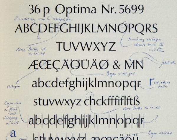
Optima has been consistently popular since the 1960s. (For whatever reason, it’s gained a particular toehold in packaging for pharmaceuticals and cosmetics.) Like most of Zapf’s work, it’s both extremely well made and preternaturally bloodless. This is the font an android would choose for their autobiography. Hard to criticize, but also hard to love.
Sometimes this style is called “flare serif” as a description of the shapes at the tips of the letters. I’m not sure it fits, however. The so-called flare serifs don’t read as serifs—a word that connotes protuberances in the horizontal direction. (Compare, e.g., “slab serif”, a term that is entirely accurate.) Rather, they read more like modulations of the stroke width in the vertical direction. Maybe “tapered stem”? Though “flareface” is catchy.
Earlier still, we have Albertus, designed by Berthold Wolpe in the 1930s:
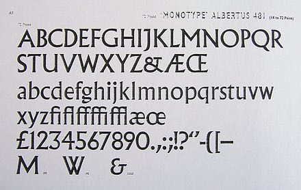
If Optima is carved out of ice, Albertus is pure warmth: strange and angular and full of unexpected details. Wolpe worked for many years at Faber and Faber on book jackets. No surprise that his own tastes in type ran toward the expressive and eye-catching. To be fair, Optima was intended for body text; Albertus wasn’t.
Or so I thought. Not long before the pandemic, I was playing Uncharted 4 and immediately recognized the in-game menu font as Albertus:
It looked fantastic! Who would’ve guessed that an odd typeface from the 1930s would turn out to be a great screen font nearly a century later.
At that point, I started to reconsider my prejudices. Maybe a font family in this tapered category could be both nicely readable and nicely weird.
Zapf and Wolpe were both calligraphers by training. Their sense of letterforms naturally arose from their understanding of how a broad-nib pen moves across the page and how the stroke changes as the nib rotates in the hand.
(Their biographies also had a nexus via Nazi Germany. Wolpe was a German Jew who fled the Nazis and, during the 1930s, re-established himself as a typographer and designer in England. The younger Zapf, also German, was drafted into the German military in 1939. Eventually, due in part to his calligraphy skills, he trained and served as a cartographer for military intelligence, preparing for the eventually aborted Operation Felix. After the war, he taught calligraphy in Offenbach—the city Wolpe had originally fled.)
Unlike Zapf & Wolpe, I have no calligraphy skills whatsoever, due to the unfortunate genetic defect of writing left-handed. Worse, I can’t even draw letters with pen & ink. Nevertheless, when I tell people “I can’t draw”, they don’t believe me. Doesn’t the existence of my font library prove otherwise? Truthfully, I’ve never thought of letterforms in terms of drawing. It feels more like building a mechanical device from small moving parts, grinding & polishing them until they mesh smoothly.
Speaking of pens. There is a theory of type design—formalized and popularized by Dutch design educator Gerrit Noordzij in his book The Stroke—claiming that letterforms arise primarily from the stroke of the pen.
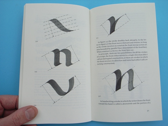
I don’t want to say Mr. Noordzij is wrong, exactly. But in the context of making fonts, I’ve always thought of letterforms not as strokes so much as constructions. And pen-based writing is one of many influences on those constructions. As an aesthetic matter, surely the most enduring influence. Though there are also plenty of fonts that have no antecedent in written forms. Moreover, in terms of what makes type on the page work—at the scale of hundredths of an inch—the behavior of a pen is only mildly instructive. Heliotrope ends up as my most calligraphic font by far, but I promise that not a single pen was wielded during its creation.
Heliotrope’s roman weights are the less weird members of the family. With these, I imagined a Mendelian breeding of Optima and Albertus that captured Optima’s clean readability with the crunchier rhythm of Albertus. (Some of the offspring had to be drowned in the river. But we got there.) If you only used these styles of Heliotrope, you’d think it was rather polite.
And then the italics appear. In typical serif families, the italic styles achieve their complementary contrast by using a completely different geometric vocabulary built from slanted, curvy strokes. But in typical sans families, the italics are often not much more than a slanted version of the roman. Optima and Albertus belong to this boring tradition.
Heliotrope does not. Instead, its italics are inspired by blackletter writing. Blackletter is the name given to the dense, dark script style today most strongly associated with German typesetting. (The Gutenberg Bible, for instance, is set in type designed to resemble blackletter writing.) Though there are many variants under the umbrella of blackletter—the curious should seek out Fraktur Mon Amour by Judith Schalansky—it is arguably the most constructed of calligraphic scripts, relying more on straight, uniform strokes instead of the round, modulated strokes we associate with the Roman tradition. (By the way, Wolpe made a wonderful blackletter typeface called Sachsenwald. Zapf made the somewhat less wonderful Gilgengart.)
For me, the most surprising feature of Heliotrope is that on their own, the italics are rather weird; but when used in body text, they provide the right amount of emphasis, contrast, and energy. That may sound like a humblebrag. But even after all this time designing fonts, the process still contains elements of experimentation and mystery. Often I feel I’m following the idea where it wants to go, not vice versa. So the destination can be, in fact, a surprise—even to me.
So what’s Heliotrope good for?
First, due to its neither-sans-nor-serif design, Heliotrope will probably find the most use as a secondary face in a layout. If you’re using a typical serif or sans for body text, Heliotrope would work as a complementary face for headings, notes, and other display or incidental elements.
Second, Heliotrope is an elegant body-text face in its own right. I can’t say I expected that when starting the project. But it turns out to have a pleasant color & rhythm that, due to its stroke contrast, isn’t fatiguing. Of course, I did some serious user research. When I completed the first prototype of Heliotrope, I used it on Beautiful Racket to see how many people complained. Nobody did. On the contrary, several wrote to ask “what’s that font?” and “where can I get it?” It’s staying. (It’s also available as a body-text option on Practical Typography.)
Third, Heliotrope is a distinctive face for user interface elements, especially in apps. This is an area where sans serif families typically rule because of received wisdom that the simpler letterforms of a sans remain more legible at the tiny sizes UI elements often must endure. This maxim isn’t without merit. But it was more true of the coarse computer displays of the 1990s. Today, with high-resolution screens being the norm, the sans advantage is much reduced. Heliotrope can hold its own in those contexts, combining the simplicity of a sans with the flavorful contrast of a serif.
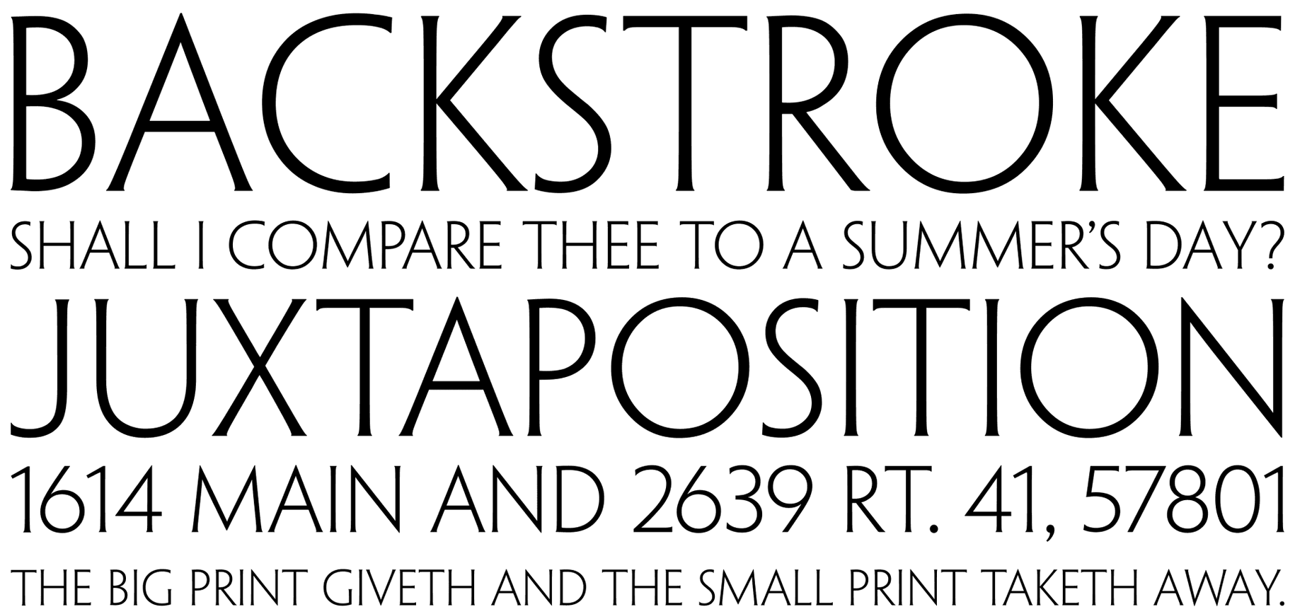
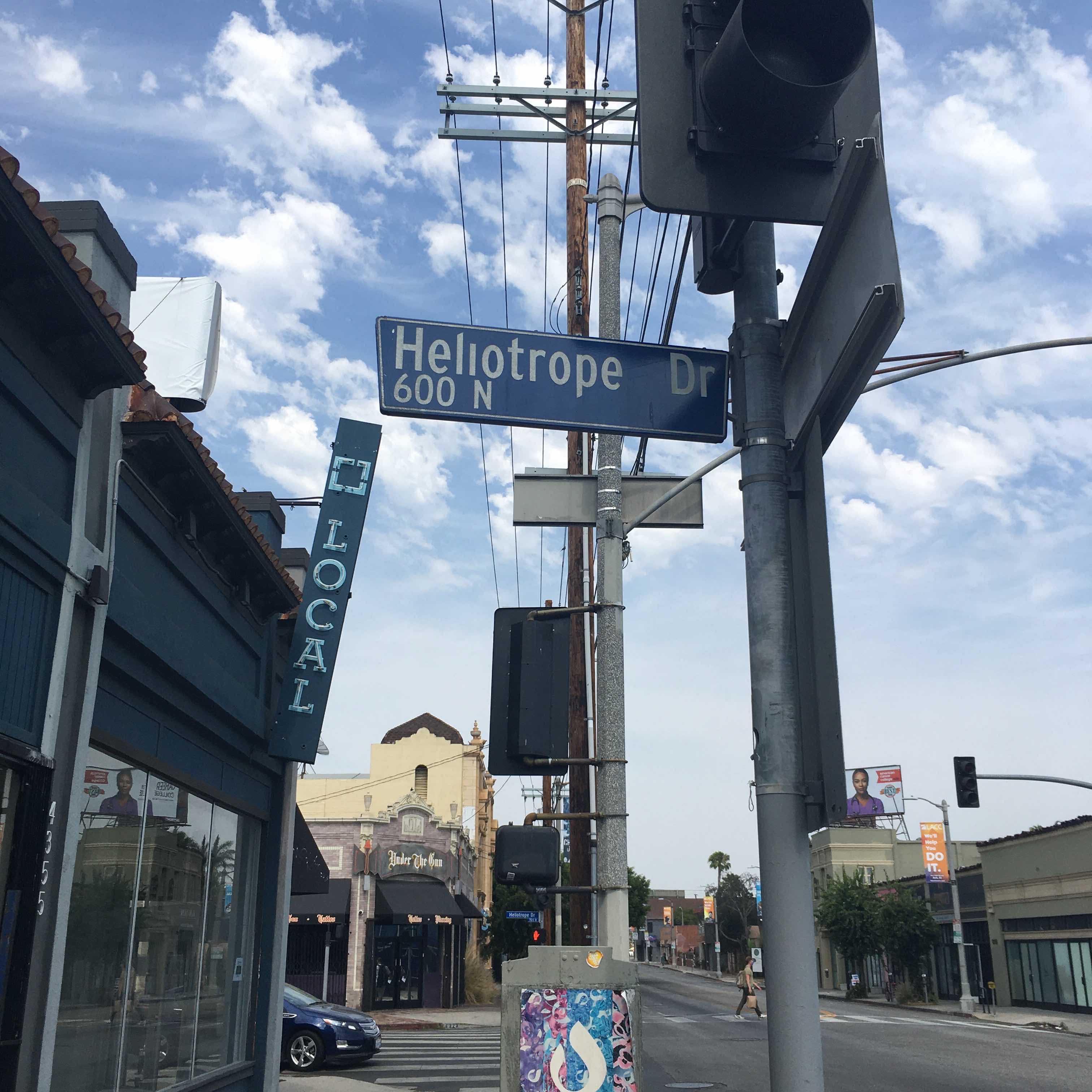
Oh, the name. Heliotrope is a flowering plant with small purple blooms and allegedly the scent of cherry pie. But I only know that because I just looked it up. I came to know the word Heliotrope because it’s a street in central Hollywood where I often ride my bike. (Curiously, LA street signs never put a dot on the lowercase i.)
Every type designer has a jealously guarded list of potential font names. Guarded because many, many good names have already been used. Discovering another feels like finding buried treasure.
Bike rides are a good source of names. To me, a good font name should be easy to pronounce, remember, and spell. These are also considerations in many street and business names. An earlier name was inspired while I was coming over a hill on my bike and caught sight of a building on Wilshire Blvd. with the word EQUITABLE at the top. Not bad. But “Equity”? Even better.
Furthermore, the name should show off the font to good effect. To that end, I like to have a mix of straight, round and diagonal letters, and ideally an ascender or descender. It’s especially nice to avoid repeating any letters (though difficult in practice).
For some strongly held but mysterious reason, I prefer names that contain plosive consonants. (Wait, has “Plosive” itself been used? Updating my secret list now …)
“Heliotrope” met all my criteria, so it went on the list. When I started this project, it immediately stood out to me as a good choice. That part—matching a name to a design—is art, not science.
I hope you enjoy using Heliotrope as much as I enjoyed making it.